Hi folks,
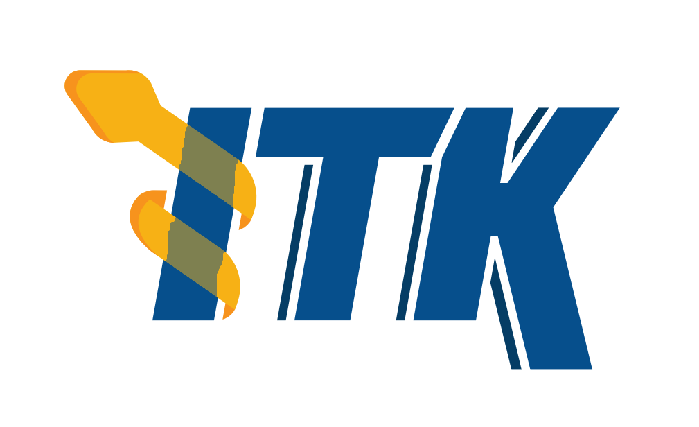
Steve Jordan, a professional graphics designer, has put effort into generating an updated ITK logo. Feedback is welcome!
Hi folks,
Steve Jordan, a professional graphics designer, has put effort into generating an updated ITK logo. Feedback is welcome!

Thanks for the effort Steve !
Is the background of this image going to stay white or be changed to transparent?
Can the snake be thinner or translucent, so that letter I can be easily recognized on icon-size scale? Right now the snake is obscuring it too much.
With both the head and this small piece of tail on the bottom being on the left, letter I is suspiciously reminiscent of letter J.
Rough sketch of removed tail and translucent snake attached:
That looks an awful lot like the vtk logo.
I like the modern toon shading styling, but I’d like to see a font more reminiscent of the current logo.
Not sure the head looks like a snake
That looks an awful lot like the vtk logo.
I don’t think that’s a bad thing given the project’s close relationship.
I like the modern toon shading styling, but I’d like to see a font more reminiscent of the current logo.
The new font is intended to give the modern look, enhance readability, and is not as complicated (bad for logos). In most cases, it will be shown much smaller than it is displayed here. The consistent thickness of the characters improves their readability and the cleanliness of the appearance.
Not sure the head looks like a snake
Any suggestions on how to improve it? Eyes, for example, will not scale well if made smaller.
Neat!
Looks super pro, thanks Steve Jordan!
Noting that I have no experience at all in design, I wonder if the asymmetry in height in the snake head and the tail of K is neccesary, it will generate empty spaces and make the letters smaller when fit into rectangular spaces. In VTK logo that asymmetry seems more natural.
A question, having to simplify the logo for the modern times, why choosing the snake instead of the eye? I would think the eye represents “Insight” better than the snake, having said that, the snake is related to medicine, so I guess is hard to choose!
Very nice, a huge improvement over the current logo. Just a few very subjective remarks:
I agree with Andras regarding the snake head. There are lots of medicine
snakes on the Internet
I also agree about the snake’s head. If I didn’t already know what the logo was, I wouldn’t jump to thinking that was a snake. I’d prefer something like this https://thenounproject.com/term/rod-of-asclepius/512877/ ? I also wouldn’t have the snake’s head go above the top of the letters.
(I know how arbitrary aesthetics can be - thank you for putting in the work to redesign the logo).
Nice job. I like it, but as @dzenanz said, the tail of the snake is a bit confusing. I think it might be clearer if it is removed or modified. However, I prefer the logo with the “I” not being transparent.
Yes, this example represents the Rod of Asclepius well. The features include the head pointing to the right, a tongue, and an eye. I don’t know if these can fit well into the logo, though.
Yes, the eye is an appealing concept for Insight. I think it is a challenge to include a complex structure into a logo, where the design principal is “less is more.”
I like the logo as Matt and Steve prepared it.
I think the eye is not really missing because Insight is implied in the first letter!
Thank you for all the feedback, some excellent points.
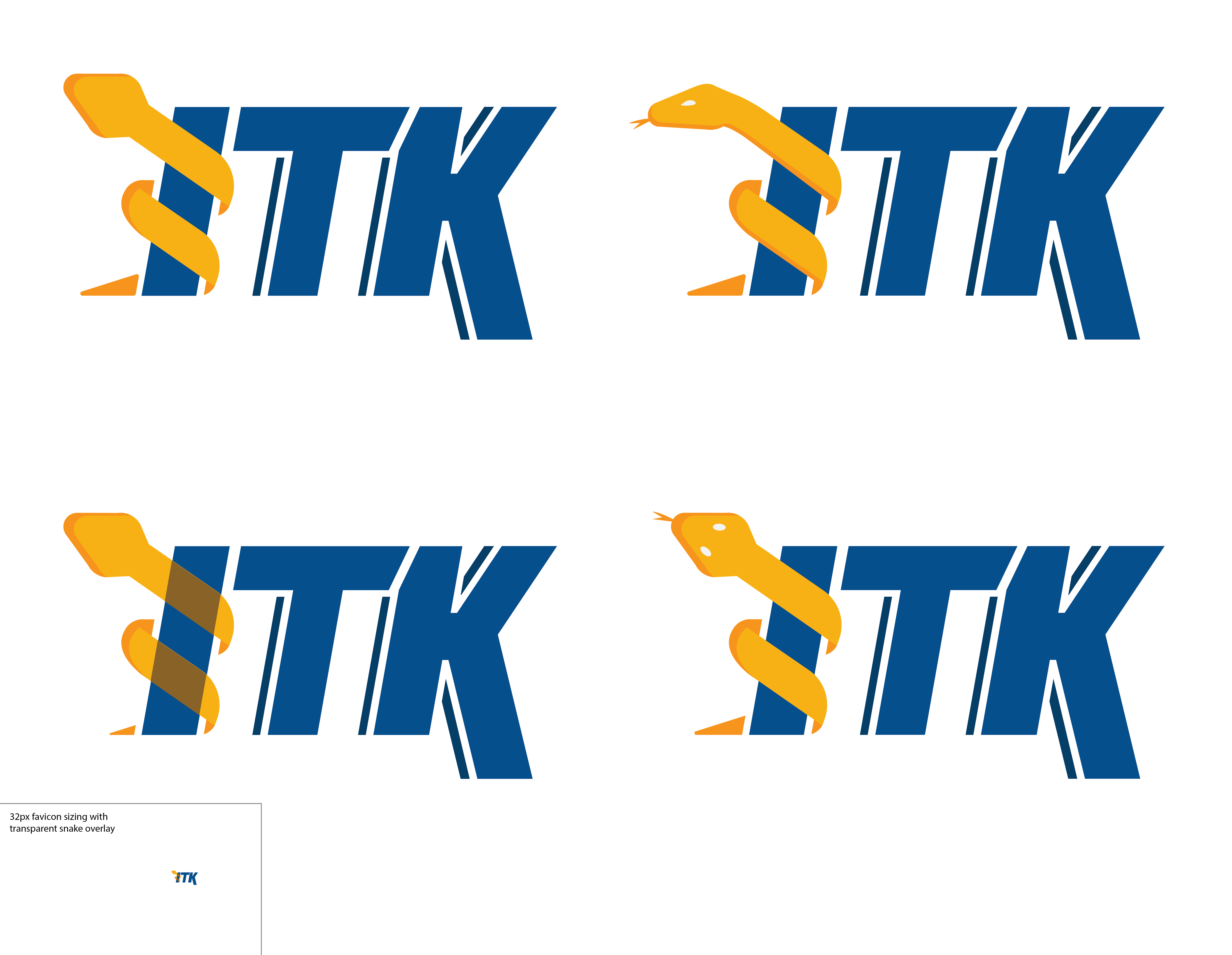
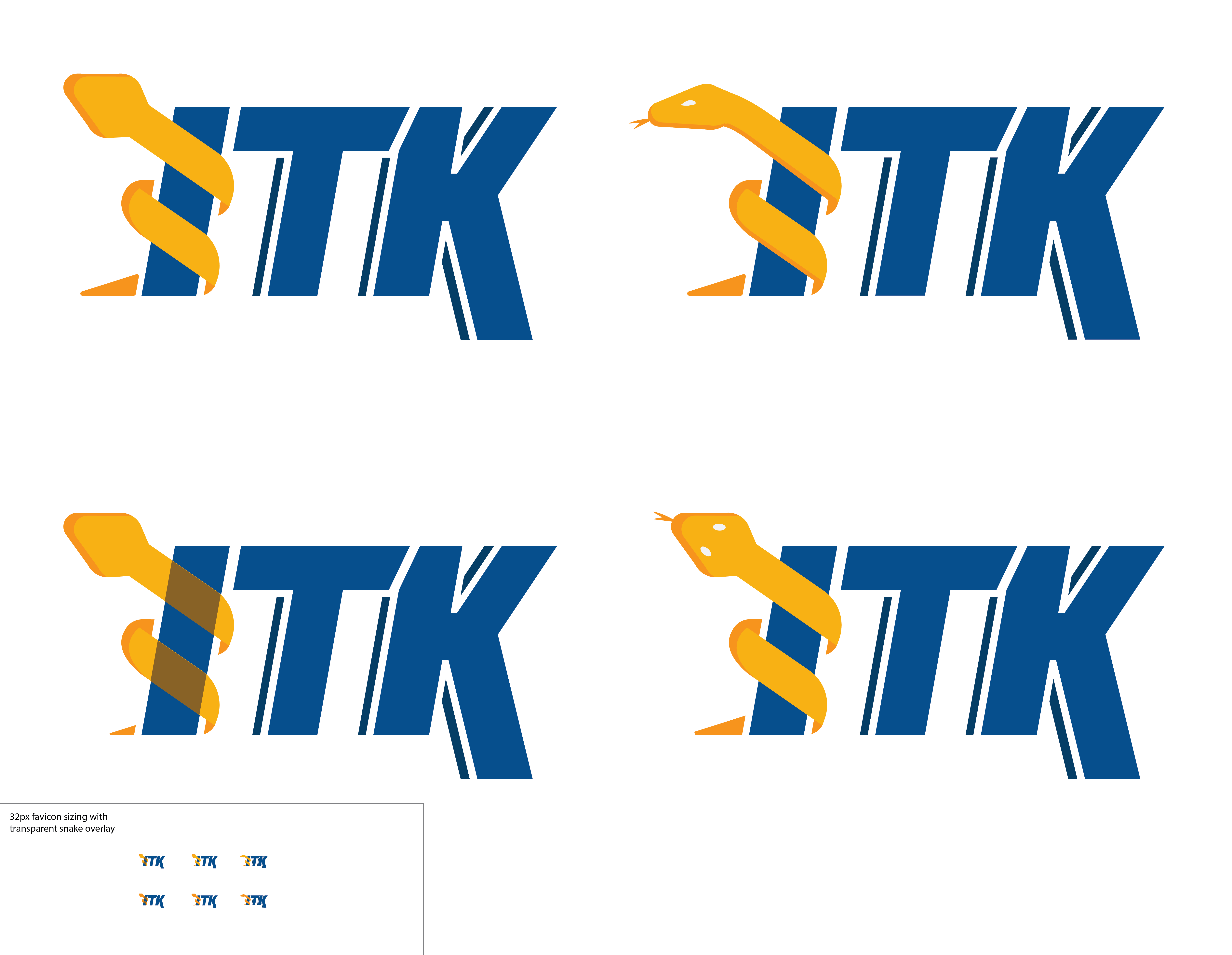
Tail tip is too small. We can remove it entirely, however I think increasing it’s size is a better solution.
Where’s the eyeball? I’d like to push for a design without the eye, while it alludes to the idea of insight, I don’t think it’s more important than the snake/rod element we’ve come to know. And like Bea pointed out, I think the Insight is implied by the first letter.
Typeface closer to the original. In all honesty, serif typefaces can be used on occasion for logos, however most serif typefaces are better suited for reading text. Serif typefaces in logos have evolved into slab serif for a cleaner, more modern look.
Transparent snake. So this is a tricky one, I can see the argument for using a transparent snake on the favicon (as seen in the attached) to help us decipher a clear “ITK” at smaller sizes.
Make the snake more snake-like! I could get behind the inclusion of the tongue/eyes to increase it’s snakiness, although these elements will be removed for smaller sizes.
With that said, check out the iterations I put together.
Thanks @SteveJ for generating all these new icons. Any chance you can generate the small version of the icon without the see-through snake, to see what it would look like? Both next to each other would be ideal to compare.
I do like the large icons with the snake with the eye (I prefer the one with one eye).
Sure thing, I have the three versions in the bottom left (transparency look, overhead snake, and side view snake). The row underneath each uses the darker yellow-orange for more visual impact at the favicon size.
Thanks Steve!
The one-eyed snake has more of a classic look. I am still in favor of removing the tail. Snake with eyes looks better than snake without eyes. We should have the transparent-snake version for the small sizes.
Those were my opinions, let’s hear what the others have to say!