Hello, everyone! I am new to SimpleITK. I was attracted by the excellent figure shown in the website for illustrating “An abundance of filters for image segmentation workflows, from classics such as Otsu thresholding to level sets and watersheds.”. I am curious how to plot such a good figure. Can someone help me? Many thanks.
Hi Kyle,
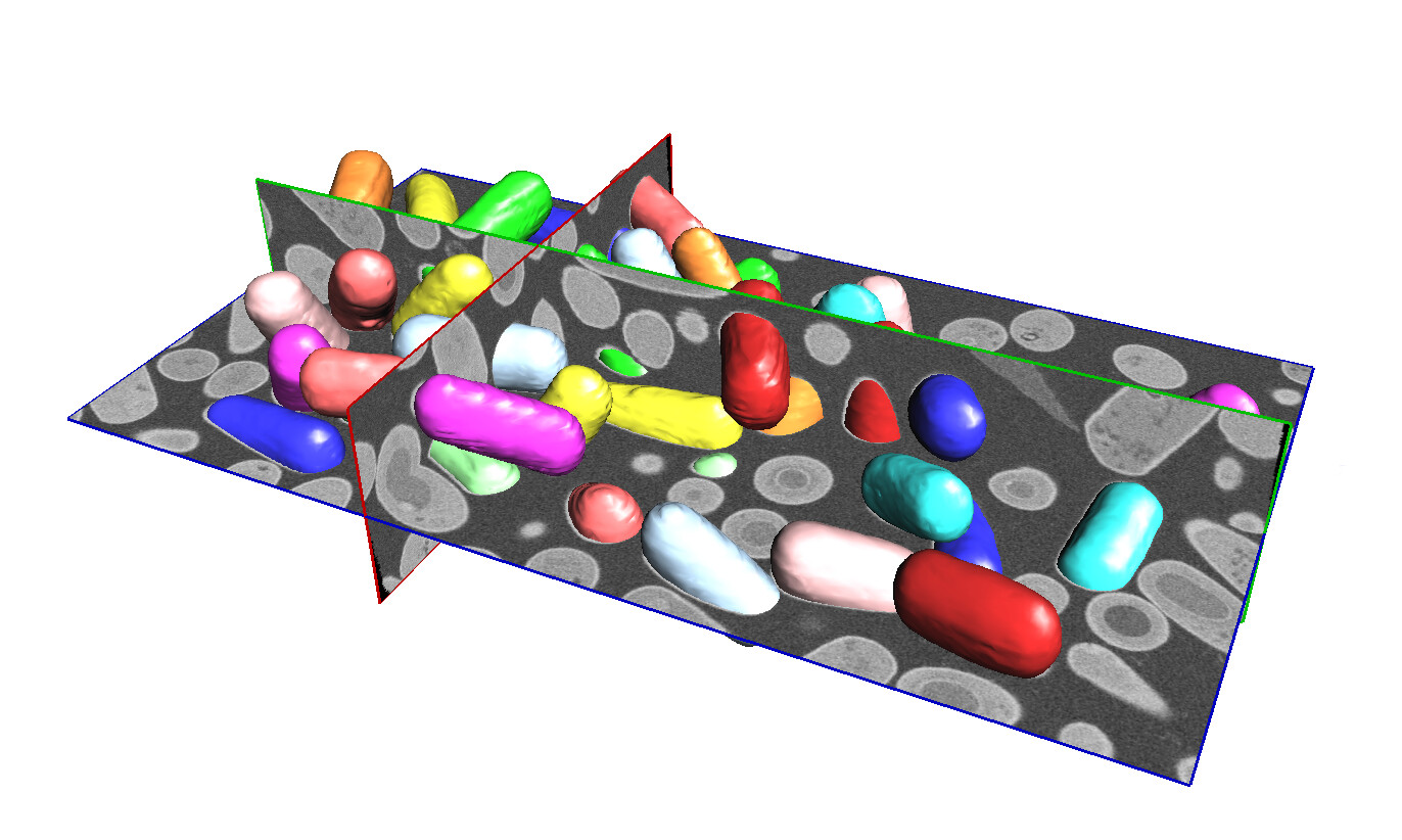
Thanks, I made that figure. I used my own renderer, although you could do it just as well in Slicer. The main trick is creating surface for each of the segmented cells and then assigning them different colors. And the original volumetric data is just shown as axial cut planes.
Here’s the pic, for anyone curious:
1 Like
The segmentation was done in a SimpleITK Notebook:
http://insightsoftwareconsortium.github.io/SimpleITK-Notebooks/Python_html/35_Segmentation_Shape_Analysis.html
1 Like
Thanks for your reply, Dave. Does this mean you don’t use the SimpleITK package to draw this figure? Can you give me more hints on how to draw this figure? Many thanks.
Actually, what I want to achieve is to combine the 3D raw image and segmentation. I’d like to use sliders to freely change the slices along three axes. Do you know how to do this? Many thanks.
I think your best bet is to learn to use 3D Slicer.
They have tutorials and YouTube videos showing how to use it.
1 Like